

Author Logo
In today’s market, readers are more visual-savvy and brand-conscious than ever. Social media, reading apps, and digital marketplaces have intensified the need for author branding. At the heart of that brand is your logo—a compact, visual signature that ties your books together, gives you instant recognition, and reflects who you are as a publishing author. Your logo lives not only on your cover design, but on your website, business cards, social media, and all marketing assets. It’s one of the most important design elements you’ll adopt in your author journey.
So today, let’s revisit what an author logo is, why you need one, and how to make yours stand out in today’s market.
For more, I have a whole series on author branding.
What Is an Author Logo?
An author logo is a visual symbol or mark that serves as a visual representation of your brand identity as a writer. It can include your name, initials, a symbol related to your genre, or an abstract mark—ideally something eye-catching yet simple enough to be memorable. The logo becomes a key part of your visual identity, so it should be designed with flexibility in mind.
It shows up on your cover design (or sometimes in the small imprint area).
It appears on your business cards, newsletters, email signatures, social profiles, and promotional swag.
It becomes a visual cue that your audience associates with you—your voice, your genre, and your quality.
A well-executed author logo helps your brand “read” as cohesive and professional from the first glance.

A Guide to Creating an Author Logo
Does an Author Need a Logo?
Absolutely. Here are several reasons why having a logo as an author is essential:
Consistency & Recognition
Your logo becomes a consistent visual thread across all touchpoints. Whether someone sees it on social media, your website, or a book spine, that repeated exposure builds instant recognition.
Professionalism & Credibility
In a saturated field, having a polished logo gives you gravitas. It tells readers, agents, and publishers that you’re invested in your brand—not just winging it on every new project.
Marketability
An eye-catching logo is easier to market. It’s a useful anchor for merchandise, promotional graphics, bookmarks, and press materials. Marketers and designers everywhere appreciate a clean, versatile logo to work from.
Flexibility in Branding
A thoughtful logo gives you room to evolve. As you branch into subgenres, start podcasting, run workshops—you want your brand scalability without having to reinvent your identity.
Emotional Connection
A well-crafted logo can tap into the psychology of color, shape, and typography, helping readers feel a tone (mysterious, romantic, whimsical) before they even click “buy.” That emotional cue can make your books more compelling.

A Guide to Creating an Author Logo
What Makes a Good Logo for Authors?
There are certain elements that make a logo stand out and work effectively for an author’s brand:
Simplicity
Clean logos with minimal lines survive scaling best. Even when shrunk down to a profile icon or watermark, the design should remain legible. Avoid clutter and unnecessary ornamentation.
Relevance & Genre Fit
Your logo should feel “right” for your genre. A fantasy author’s emblem might incorporate mystical elements; a thriller author might use stark, bold lines and sharp angles. The logo is part of your genre-language, much like the conventions in cover design or tone.
Scalability & Versatility
Your logo should look good across scales—from a Twitter avatar to a 3×5 poster. Test it in color, in black and white, and in reversed (light-on-dark). Also consider how it works in single-color or one-tone versions.
Memorable & Unique
Distinctiveness is crucial. Avoid overly used tropes unless you’re giving them a unique twist. A logo should linger in a reader’s mind—not blend into the crowd.
Strong Typography
If your logo includes your name or initials, the font choice becomes part of the design. Custom letterforms or tailored type make your logo feel bespoke. Pay attention to kerning, legibility, and how the font interacts with any symbolic mark.
Color Strategy
Your palette should reflect your brand’s emotional identity (see more on color strategy below). Be cautious with overly trendy hues unless they align with your long-term brand. Include fallback shades (e.g., grayscale) for applications where color isn’t viable.
Submark & Variations
Design with flexibility—create a full logo and also a submark (a simplified version) for small spaces (e.g. favicon, watermark). That way, your brand is cohesive at every scale and format.

A Guide to Creating an Author Logo
How to Create a Logo for Authors
Step 1: Define Your Brand Essence
List adjectives that describe your writing: atmospheric, playful, bold, lyrical. Understand who your ideal reader is and what emotional tone you want to evoke. These guide your design directions.
Step 2: Research & Moodboarding
Gather visual references—book covers, logos, typography you admire. Track current trends in author branding (for instance, minimal line-based logos, sleek monograms, or motion logo elements). Create a mood board that captures possibilities.
Step 3: Sketch & Brainstorm
Start with pencil and paper. Sketch dozens of logo concepts—monograms, symbols, abstract marks. Don’t worry about perfection; the goal is variety. Then narrow to 3–5 strong ideas. If you’re interested in hiring a designer, I highly recommend Kelsey, who designed my logo.
Step 4: Digital Wireframes & Prototypes
Convert your sketches into vector mockups in software like Illustrator or Figma. Apply your color palette ideas (including black-and-white versions). Try different weights, alignments, and spacing to test readability.
Step 5: Refine & Test
Get feedback from fellow authors, readers, or a designer. See how your logo appears across formats (website headers, small social avatars, cover thumbnails). Make adjustments until it scales cleanly and reads clearly.
Step 6: Finalize Variants & Export
Produce final files: full-color, black & white, reversed, submark, horizontal, vertical—all in vector format (SVG, EPS). Include guidelines (clear space, minimum size) for future use.
Step 7: Deploy & Update Everywhere
Once live, roll out your logo across your site, cover design, email signatures, business cards, promotional materials. Consistency is key. Over time, monitor how well it resonates—and allow for occasional refreshes as your brand evolves.
A Guide to Creating an Author Logo
Writer's Logo Ideas
Here are a few ideas to inspire your author logo design:
Monogram Logo
Use your initials in a stylish, elegant font to create a timeless logo. This is a great option for authors who want a minimalist and professional look. A monogram logo is perfect for literary fiction or non-fiction writers looking for a clean and sophisticated brand image.Symbolic Logo
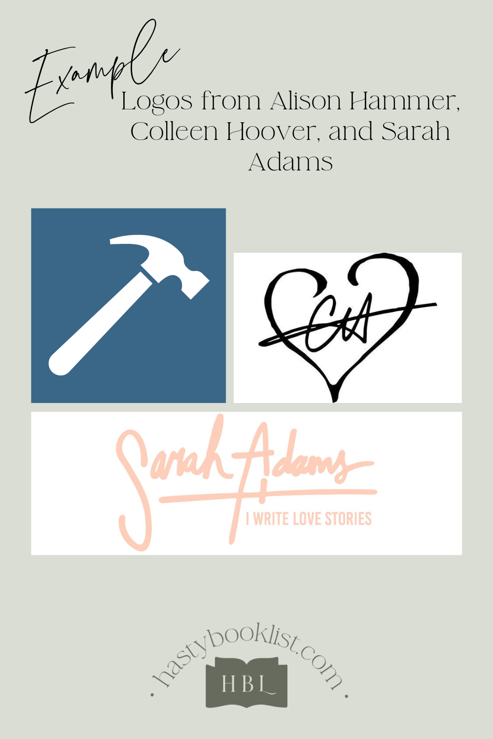
Incorporate a symbol related to the genre you write. If you write fantasy, you could use imagery like a quill with an enchanted glow or a mythical creature. For romance authors, hearts or roses can subtly convey the genre. These logos are great for drawing in your specific audience.Signature Logo
A signature-style logo uses a custom script font or even your actual handwritten signature. This personal touch can make your logo feel intimate and authentic, which works well for memoirists or authors of personal, emotional works.Illustrative Logo
Consider an illustrative logo that reflects the stories you write. For children’s authors, a playful, colorful illustration (like a whimsical tree or character) can capture the imagination of young readers and parents alike.Geometric Logo
Geometric shapes give a modern, sleek look that can be used by authors in contemporary genres like sci-fi or thrillers. Clean lines and abstract shapes can give your brand a futuristic and bold edge.
Building a personal brand as an author is essential for making your books and name stand out. A strong logo is the cornerstone of that brand, helping you establish a recognizable presence in readers’ minds. Whether you opt for a simple monogram or a symbolic illustration, your logo will serve as a visual signature, tying your work together and setting you apart in the competitive world of publishing.

A Guide to Creating an Author Logo
Choosing Color Palettes for Your Logo & Brand
Since color plays a critical role in author branding, here are advanced tips to get it right today:
Emotion-Driven Palette: Start by deciding what you want your readers to feel when they see your brand (trust, intrigue, warmth, etc.). Then choose 2–4 dominant hues plus neutral support colors.
Stay Nimble: While you want consistency, allow for secondary accent colors that can shift with sub-series, seasonal promos, or tie-ins, so your brand doesn’t feel rigid.
Accessibility & Contrast: Ensure your logo color combinations pass accessibility checks—sufficient contrast helps readability for all audiences. Also test for color-blind friendliness.
Trend Awareness (but with caution): It’s useful to see current design trends—gradient duotones, subtle textures, motion in logos—but always check they amplify your brand, not distract.
Testing in Context: Before locking in colors, place them on cover mockups, social banners, and thumbnail views. If a hue washes out or competes with cover art, it needs tweaking.
Bonus Tips & Fresh Insights (2025 Edition)
Animated & Motion Logos: In an era of video content and social media, creating a subtle animated version of your logo (e.g. pages flipping, ink flowing) makes your brand pop in video intros or Reels.
Responsive Logo Designs: Some brands now use “responsive logos” that adapt—full form on desktop, minimal “icon + initial” version for mobile screens.
Layered Texture Elements: Contemporary design often includes nuanced texture (paper grain, ink splatter, halftone) layered into logos—if it suits your genre. Use them sparingly, so the mark remains legible.
Sub-brand Extensions: If you write in multiple genres or have a side publishing imprint, create subtle offshoots of your main logo (color-shift, minor emblem tweaks) so all parts still feel cohesive.
Legal & Protection: Once your logo is finalized, consider trademarking it (if you want brand protection) and retain full ownership of your design files.
Final Thoughts: Make Your Logo a Living Part of Your Brand
A strong author logo isn’t a one-and-done asset—it’s a living design element that evolves as your career grows. Update it carefully, test it in new contexts, and think of it as one of your most strategic branding tools.
If you’d like help sketching ideas, evaluating mockups, or turning your vision into vector form—I’d be happy to help you apply these refreshed tips in 2025.

